Divergent Bar Graphs (R)
A divergent Bar Graph can be an excellent way of sorting and contrasting data.
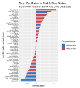
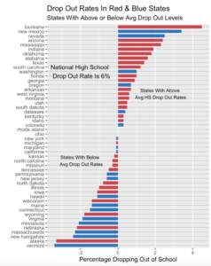
Here we will look at percentage of kids in each state who drop out of high school and whether that state voted Republican or Democratic in 2016.
Here is what our data look like:

About those columns:
“drop_out” is each state’s drop out rate.
“Number” : Republicans 1, Democrats 2.
“Avg_dropout_rate” is the nation;’s avg.
“comparison” is the state avg minus the national avg.
“type” is whether “comparison” is above or below 0.
Next we order the data on the comparison column.

Next we designate the color scheme:
“`{r}
party_colors <- c(“#2E74C0”, “#CB454A”)
“`
Then we plot

Next we will add some text and remove that needless legend.
“`{r}
B +
theme(panel.grid.major.y = element_line(colour=”black”, size=0.07))+
annotate(“text”, x = 35, y = 2.25, label = ” States With Above \n Avg HS Drop Out Rates”,size=3)+
annotate(“text”, x=20, y= -2,label= “States With Below \n Avg Drop Out Rates”,size=3)+
annotate(“text”,x=40, y=-2,label=”National High School \n Drop Out Rate Is 6%”)+
theme(
plot.background = element_rect())+
ylab(“Percentage Dropping Out of School”)+
xlab(“”)+
theme(legend.position=”none”)

“`
Recent Comments