Life Expectancy, Lead Levels, and Race in Nassau
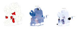
Triptych: A Closer Look At Lead Levels
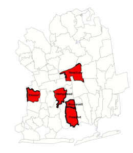
Here are the five Nassau County zip codes that had the highest number of elevated lead levels in children’s blood tests between 2000 and 2017.
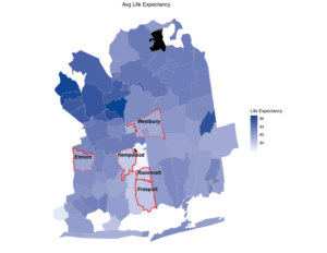
Now for some perspective here are the life expectancies in Nassau County with the zips with the highest levels of lead highlighted in red.
The lightest areas , those with the lowest life expectancies , are mostly the same zips with the highest lead lead levels.
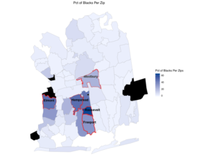
Below is the percentage of African Americans living in each zip ,again with the highest number of lead reports highlighted in red.
The lead level data comes from NYS and excludes NYC. Every child in NYS is tested for lead at between the ages of 1 and 2 y.o. Each child with an elevated lead level is only counted once in this data. These reports are only of dangerous lead levels . With that said, we do not make a distinction between the varying levels of lead poisoning. Any elevated level it too high and so we treat all elevated lead levels equally.
Using R and the Choroplethr package we will map the zip codes with highest lead levels, lowest life expectancies , and the percentage of African American living in each zip code
The data is reported at a state level so the first thing to do is to filter out Nassau county data.
#Filter Nassau county rows from the NYS data
Nassau_Lead<- filter(NYS_Lead_Data, County == “Nassau”)
Oddly some of the variables are not numeric so we need to fix that.
Nassau_Lead_Levels$ten_to_15 <- as.numeric(Nassau_Lead_Levels$ten_to_15)
Nassau_Lead_Levels$fifteen_or_more <- as.numeric(Nassau_Lead_Levels$fifteen_or_more)
We are treating every report of elevated lead level the same so we will sum together the varying levels in a newly created column called SUM.
Nassau_Lead_Select<- Nassau_Lead_Select %>%
mutate(sum = rowSums( . [2:5]))
View(Nassau_Lead_Select)
Next we will control for population. More populous zips would probably have a higher number of reports. We will account for this by dividing the number of reports by the zip code’s population. We will call this new column per capita
Nassau_Lead_Levels_2<- Nassau_Lead_Levels_2 %>% mutate(per_capita = total_reports/population)
To plot choroplethr needs a column named REGION and another named VALUE so we need to rename our columns.
Nassau_Lead_Levels_2<- Nassau_Lead_Levels_2 %>% rename(value = per_capita)
Finally we plot like so
Lead_Levels_Plotted<- zip_choropleth(Nassau_Lead_Select,
county_zoom = 36059,
title = “Lead Levels Per Zop”,
legend = “# of Reports Per zip”, num_colors = 1)
Lead_Levels_Plotted
Plotting Life Expectancies and the percent of African Americans per zip code is exactly the same.
Then export the plots as PDFs and edit in SKETCH to add the re boundaries.
Complete code can be found at: https://github.com/JF11579/Choropleth_Lead_Nassau
Recent Comments