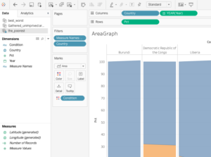
Tableau Area Graph
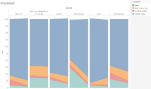
In this post we will prepare and graph W.H.O. data using R and TABLEAU and ultimately produce the compact side by side bar chart-like area graph above that has four axis.
A google search of “water drinkable developing nation” brought me to this Uncief page which cites data collected jointly by the WHO and UNICEF:
https://data.unicef.org/topic/water-and-sanitation/drinking-water/
It is a multi page workbook but the one we are interested in looks like this:
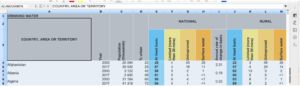
It has its issues. The top line is only a title. The third line has vertical text. The second line is empty for the first 20 columns. Thinking I might need to insert a new row and manually rewrite this second line I copied & pasted it into Google Sheets but Google was well ahead of me and rotated the column headers automatically. A beautiful thing.
Google sheets proves to be too slow . Instead we will open the data in Libre Calc Sheets
Rename the cols so complete hierarchical info is in each cell , not just “at least basic” but “unimproved” +” national” + “at least basic”: unimproved_national_at least basic
Also this is 2 data sets side by side. A column named country appears twice. Label the improved side country_2 and year_2.
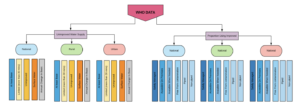
THOUSANDS of meaningless rows. Export to R to remove by location.
Now in R…
#PACKAGES
library(tidyverse)
library(stringr)
#IMPORT THE DATA
water_area<- read_csv(“Watersafety_3.csv”)
VIEW(water_area)
#SELECT THE RELEVANT COLUMNS
water_area<- water_area %>% select(country, year, 16:19)
#Some of the columns have “<” and “>” signs .
#We will get rid of them with stringr
#REMOVE EXTRANEOUS CHARACTERS
water_area<- as.data.frame(sapply(water_area, gsub, pattern = “<|>”, replacement= “”))
View(water_area)
#The column names could turn out to be problematic so we will revise them.
# These col names could prove to be problematic.
water_area<- rename(water_area, “basic” = “unimproved_urban_at_least_basic” )
water_area<- rename(water_area, “min_thirty_min” = “unimproved_urban_limited_(more_than_30_mins)” )
water_area<- rename(water_area, “unimproved” = “unimproved_urban_unimproved” )
water_area<- rename(water_area, “surface_water” = “unimproved_urban_surface_water” )
View(water_area)
We need the dates in a single column for TABLEAU so we will use Tidy R’s gather function:
water_area_gathered<- water_area %>%gather(“condition”,”pct”, 3:6)
View(water_area_gathered)
We will only consider the poorest countries so we will subset:
the_poorest<- water_area_gathered %>%
filter(country %in% c(“Liberia”,
“Central African Republic”,
“Burundi”,
“Democratic Republic of the Congo”,
“Niger”,
“Malwai”,
“Mozambique”,
“Sierra Leone”))
# Next we export it as csv to import it into TABLEAU
write_csv(the_poorest, “the_poorest.csv”)
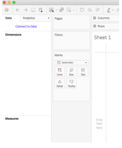
Loading data into TABLEAU is easy.
When one opens TABLEAU Desktop for Public this screen greets you.
Click on the blue hyper-link , since our file is a csv we select text from the next screen
Now one is on the Data Source. Look at the bottom left.
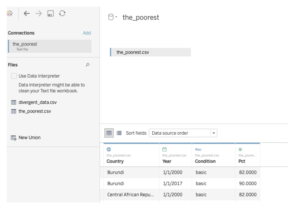
But TABLEAU is not finished processing the data.
Click on Sheet 1 at the bottom left:
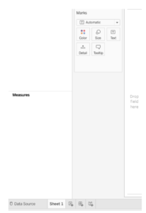
Now TABLEAU has divided your data into Dimensions and Measures, something like Variable names and data.
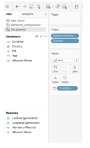
Creating a graph is as simple as dragging individual Dimensions and Measures to the correct place. To create our Area Graph do this. Note: above those 4 colored dots is a drop down menu. Click that and select Area Graph.
Recent Comments